Thursday, February 28, 2013
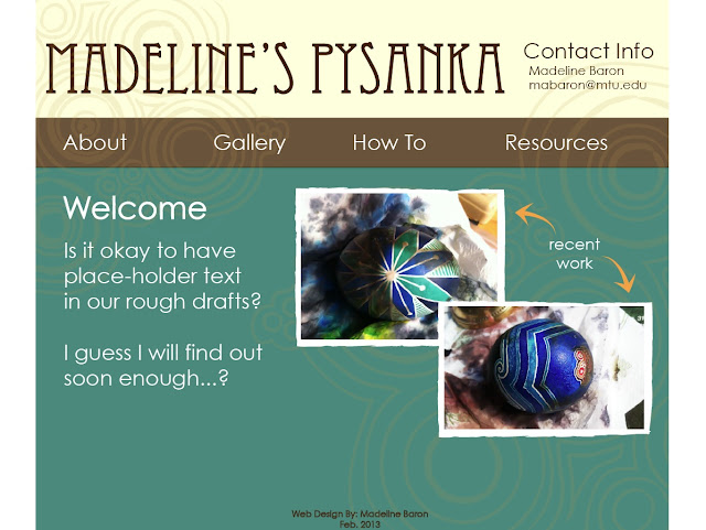
Madeline's Pysanka
I may have jumping off the deep end but we'll see where I can get with this.
Madeline's Pysanka
( I'm not done )
Madeline's Pysanka
( I'm not done )
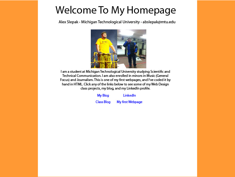
Personal Webpage Draft
Here's my current draft.
Here's the previous draft.
I've spent the last hour and a half on:
Here's the previous draft.
I've spent the last hour and a half on:
- Moved many style elements from in-line styling to an external style sheet.
- Added head and associated elements.
- Center bar in background is now "position: fixed" instead of "position: absolute." This makes it move with the scroll. Sounds a little nitpicky, but...
- Fixed issue whereby, due to styling, if the content is longer than the browser window, it gets cut off and the user can't scroll down.
- Removed <br> tags and put text in it's own div. This will also fix issues from smaller browser windows (such as smartphones).
Rough Draft
I realize this needs a lot of work. For instance, I'm still working on the javascript code for the slideshow to actually work. I'm open to suggestions though!
Website
Website
Wednesday, February 27, 2013
Draft aka Blood, Sweat, and Many Tears
Draft
I'm open to any feedback! I realize there are some rough spots...I hope to fix them in the final version.
I'm open to any feedback! I realize there are some rough spots...I hope to fix them in the final version.
Joining the Club
I posted my draft in the comment section of the earlier post but, I'm going to post it here as well...so:
Tah-da!
Tah-da!
Webpage Draft
My webpage draft
HI all,
The link to my personal webpage draft is above. I am SUPER open to suggestions and coding tricks!!! This is nothing like my initial Illustrator mock-up and that makes me sad.
HI all,
The link to my personal webpage draft is above. I am SUPER open to suggestions and coding tricks!!! This is nothing like my initial Illustrator mock-up and that makes me sad.
Tuesday, February 26, 2013
Website Draft
There are a couple things to know before completely evaluating this draft. I know that this is supposed to be our personal webpage draft but while creating this I was having troubles coming up with ideas for my side links. I decided that it wasn't too important what information was being shown right now so I made it for my hockey team. The yellow box at the top right is supposed to be our logo as well.
The overall "look" and set-up are what I am looking to use.

The overall "look" and set-up are what I am looking to use.

Monday, February 25, 2013
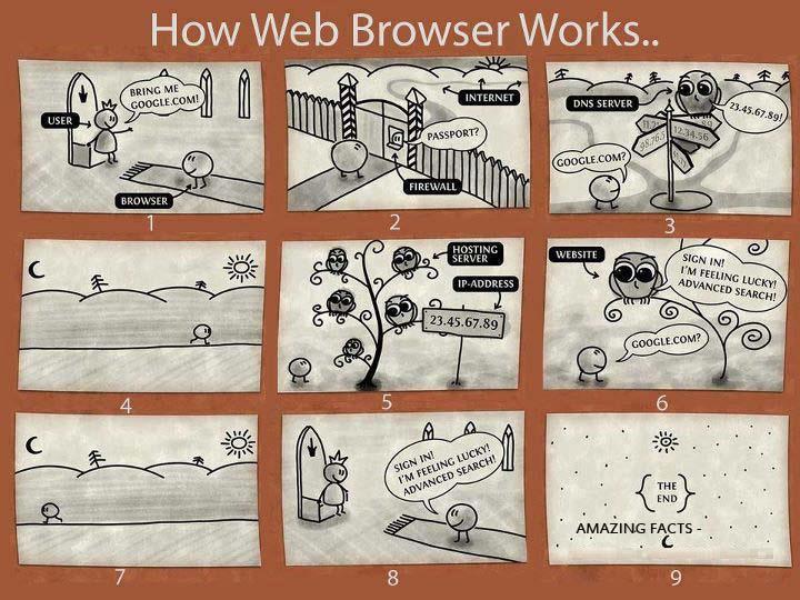
The Grid System
Hey everyone! I don't know if this is going to be of interest to anyone as they work on their web page. Apparently the actual implementation of it requires a lot of package downloads and stuff, so it might not be viable right away. Overall though, it's a really cool concept to acquaint yourself with because it definitely helps you think about web scalability and usability. Plus, Dreamweaver has a feature that you might consider using in the future that utilizes a grid system sort of like this.
Whatever the case, it's a great idea to read about!
Here's a link to a resource guide on the grid system
Whatever the case, it's a great idea to read about!
Here's a link to a resource guide on the grid system
Webpage Draft
Here is my draft of my webpage.
I wanted to keep it simple so that I would be able to fit in everything that I wanted to.
I wanted to keep it simple so that I would be able to fit in everything that I wanted to.
Sunday, February 24, 2013
Six strike rule
I don't know if anyone in the class torrents or not. But if anyone does this article might be of some interest. Six strike rule is pretty much if you get caught torrenting six times you face different means by the internet provider to get you to stop. According to the article as well as it source TorrentFreak this will more and likely go into effect tomorrow. I just thought that I'll post this and give those who might a warning.
Saturday, February 23, 2013
*rough* Draft
Alrighty folks, here's my *rough* DRAFT....well an explanation of my draft. It's very simple, but I need to keep it that way or I will get in over my head in coding and html. I've learned from my past mistakes, so this time, although it may give my visual designer side a sour taste in the mouth, it will only help my coder side!
Please, tear it apart.
p.s. if the text is too small to read use the command/control + (+) function!
Thanks!
Sam
Please, tear it apart.
p.s. if the text is too small to read use the command/control + (+) function!
Thanks!
Sam
Website Draft Image

I will upload this to my web server once I get to Walker to mount the drive. This particular page of my site will be a blog like area with an image header for each article (the light pink section). It will also have related resources, articles, or websites on the right hand side. The links will be along the top bar, and related links of each category will appear underneath the top bar buttons as each is clicked on. The logo image will link back to the main page.
I have a couple other pages I've worked out as mock images, but this is the one I've currently submitted. Later on I might upload more of the mocks, but for now I'm focusing on this one because this is the "main" layout for the website pages so it's probably the most important.
Feedback and comments are totally appreciated!
Personal Webpage

Posted as a photo until I can get multidrive mounter working on this Mac. The idea is to have the headings at the top go to other pages, and the image in the middle will be a slideshow.
Here's the link to open in browser: My Webpage
Fingers Crossed...
Hello everyone,
I have my fingers crossed that this will work.
Hopefully here is a rough draft of my page.
Link to My Page?
(I've been having technical difficulties)
Here is a picture as well...
I have my fingers crossed that this will work.
Hopefully here is a rough draft of my page.
Link to My Page?
(I've been having technical difficulties)
Here is a picture as well...

Website Draft
So this is my working draft of the website. I plan on using a light blue background with two different shades of browns as the color for the test. Because I haven't decide exactly what the paragraph section should say about me I just interested quick blurb that will be change at a different date. I also choose place holder pictures with plans on replacing them later.
Website Draft
Website Draft
Webpage Draft
http://www.hu.mtu.edu/~tggendro/Webpage_Mockup
This is the draft of my webpage. It isn't complete yet, and I'm sure there will be quite a few changes. Any feedback is appreciated!
This is the draft of my webpage. It isn't complete yet, and I'm sure there will be quite a few changes. Any feedback is appreciated!
My Webpage Draft
My Webpage
It's not much, because I feel like it's better to aim low and achieve more. So I know that it's nothing fantastic, but I hope to be able to code it.
It's not much, because I feel like it's better to aim low and achieve more. So I know that it's nothing fantastic, but I hope to be able to code it.
Webpage Draft
here is my Draft.
My plan is to make a page which acts as a source of information for anyone who uses my server I run for a popular game. It contains the standards that have already been agreed upon as well as links to various resources some of the players use often. Included in it is also some images to help orient the user.
The layout of the page is subtle and tries to use motifs that are not to cliche but still familiar with the game itself.
Friday, February 22, 2013
Rough Draft
My rough draft.
It's not much yet; the main here I was testing was the goal of the website, the text, and the color scheme. I'm still not really sure what I want to do with the whitespace and when it comes to doing the hard coding I may have to change my idea bout the top and bottom decoration. But it's a start.
It's not much yet; the main here I was testing was the goal of the website, the text, and the color scheme. I'm still not really sure what I want to do with the whitespace and when it comes to doing the hard coding I may have to change my idea bout the top and bottom decoration. But it's a start.
Web site draft!
I decided to make a webpage dedicated to normal college students who, like everyone else, gets sick in the middle of a long, cold winter. Personally, I'm incredibly stubborn when it comes to seeking relief for common colds (etc.), so I've found some helpful ways to prevent the sick and to feel better as fast as possible. I included tips on preventing and tips on feeling better without wasting time at the doctor's office and without using medicine, as well as an intro to the webpage and an about me section, as well as my contact info.
As for the actual design, I chose the color light blue because it is often associated with relaxation, comfort and healing. I found this appropriate for a site dedicated to health. In addition, I tried to incorporate a table as well as some graphics and images. However, I feel like I could have been more creative with the colors/overall design. So feedback/ideas are appreciated!!
Here's my draft!
Thursday, February 21, 2013
Design ROUGH Draft
Katelyn's Draft
A few of these requirement I am still working on and will continue to work on over the weekend. I look forward to everyone's comments.
1. About me section
2. Description of webpage: I love to bake, and I love to write and take pictures. I thought maybe this could be a way to encompass all three of those things into one. I have always been interested in starting (and keeping up) a food blog, specifically about baking, as
well as photographing food. :)
My grandma really inspired me to begin baking because of the things she made when I was growing up. I thought maybe I could include something about her as well.
3. Recipe cards are key with my Grandma, so including them somewhere into the design is something I really want to do. I didn't have the time before this draft was to be submitted.
4. I also have an interest in vintage cards and antiques because of my mother.
5. Baker's Blog and photos will hopefully be links to external sites in the near future. :)
Painting with the Colors of the Wind(ows)
(Okay so Blogger decided to throw this in drafts....I totally wrote it last night and realized this morning it wasn't there. Weird.)
WOO COLORS YEAH WOO. Okay now that that's out of the way....color theory. I feel like the color wheel intro is something that almost everyone's been introduced to at this point, but it definitely opens the discussion in a friendly and inviting way.
Color use on websites and for brands really is a huge, HUGE deal. The Alberts & Geese article's examples further prove that point. They took the same websites and utilized different color schemes on each of them...there's really no contesting the point they made. The website feels different on the premise of color alone. Color theory, meaning, and usage is such an integral part of design; but when it comes to websites, websites typically are a form of marketing...and in marketing that color meaning matters so much more.
The smashing magazine "Color Theory for Designers" article is a really great reference that I think I'll end up bookmarking for the future. Sometimes a designer knows their color meanings, they know the look they need to portray, and they still can't come up with the color scheme that achieves it how they would like to. The examples given in this article were really great representatives of each color and how they can pair with others to achieve different looks. I really enjoyed paging through the thumbnails here and considering each color scheme in turn.
Color theory was something interesting for me to see in action during my internship as well. The company I was working for hhad the professional, serifed dark blue logo of a "company that means business". When I began developing designs for our application I was still stuck in "my old ways", with rigid, fixed HTML and a design that felt almost too professional, to the point of losing a human element. I was asked by some of my co-workers and managers why I hadn't considered using the new branding the company was kicking off. My answer was more or less I didn't know that I was allowed to. Once I had the go-ahead, my whole view of the project flipped just by seeing the new branding. Gone were the dark blues and serifs; the company had switched to lime greens and plum with a custom font sans-serif logo. The switch inspired me to work on a more scalable, free flowing application that matched the vibrant spirit of the new company branding. This was where I began realizing I had a lot more to learn about HTML, and began rethinking my entire process - for the better. It's amazing how color theory can alter perception and meaning just like that!
Something really cool that I recalled seeing from a past class is this diagram from Information is Beautiful. The Visual Miscellaneum is a book that I've loved and wanted to buy for quite a while (and I see now there's a new edition so yay I must find it!), and this is a page from it describing how color is percieved in various countries of the world. It's quite interesting, and especially for the designer who has to consider an international audience it could be very handy!
"At the end of the day, pretty colors make people drool." — Nathan Rice
Draft: Personal Webpage Illustrator
Post a link to your draft here by midnight on Saturday. Within 48 hours post feedback to two of your peer's designs.
Okay, so from these articles, we receive handfuls of information on colors. So instead of trying to sum up all of the colors in 3 paragraphs, I did a little break down of all of them. To start it all off: Color
theories create a logical structure for color. .....yes, logical, people
Three
basic categories of color theory that are logical and useful:
·
Color Wheel
·
Color Harmony
·
Context of How
Colors are Used
The
Color Wheel
·
Color circle,
based on red, yellow, and blue
·
Primary
colors:
- Red, Yellow,
Blue
-The three colors that cannot be mixed or formed by combining other colors-All other colors formed from these three hues.
-The three colors that cannot be mixed or formed by combining other colors-All other colors formed from these three hues.
·
Secondary
Colors:
- Green, Orange,
Purple
- Formed by
mixing primary colors
· Tertiary Colors
· Tertiary Colors
- Yellow-Orange,
Red-Orange, Red-Purple, Blue-Purple, Blue-Green, & Yellow-Green
- Formed by
mixing a primary and a secondary color
Color Harmony
·
Color Harmony
creates inner sense of order, visual balance
·
Extreme unity
leads to under-stimulation, extreme complexity leads to over-stimulation.
Harmony is a dynamic equilibrium
Harmony is a dynamic equilibrium
·
Formulas for
Harmonious Color Schemes:
1. Scheme
based on analogous colors
- Any three
colors that are side by side on a 12 part color wheel.
-Usually one
color is dominant
2. Scheme
based on complementary colors
-Any two colors
which are directly opposite each other
-Creates
maximum contrast and maximum stability
3. Scheme based on nature-Regardless of whether it fits into a technical formula, natural color harmony works.
3. Scheme based on nature-Regardless of whether it fits into a technical formula, natural color harmony works.
Color Context
·
How color
behaves in relation to other colors and shapes
·
Different
readings of the same color can be seen when surrounded by different colors
And that right there ^^^^ is basic color theory.
Another article delved into the many interesting and fascinating descriptions of all of the different meanings of color. I won't go into every single one now, but will definitely be referring back to this page when I take about 8 hours to pick out the colors I will use for my website.
Color!
Color makes up everything. Without color, nothing would be interesting. When it comes to web pages, color is very important. A basic black and white color scheme with neutral colors shows viewers that the creator wants to be taken more professionally. A webpage with vibrant colors says to the viewers that the creator is fun and more artistic. Personally I would steer towards more vibrant colors, especially for the web page that I want to create. By using bright colors I will tell the viewers of the site that the person who owns the web page is creative and fun. The readings stated that green is calming and down to earth. It adds color but not too much. I have a feeling that my client will want to have green on her page. There is a fine balance that needs to be achieved with color. If too much is used then it can overwhelm and information that is on the site can be lost. If there is not enough it can bore the viewer. Using colors as accents with neutral colors is a great way to find a color balance.
I never would have thought that color scheme influences trustworthiness. I feel that when finding a site to be trustful or not, a person will decide based on the layout and design. If the site looks haphazard and blocky they may not trust it as much. But then again, if a site is covered in electric blue and yellow it may look like a paint project and not a serious site. I noticed in the Alberts and Van der Geest reading that they stated that users distinguished four dimensions as influencing preference for designs. The dimensions were beauty, mostly illustrative images over text, overview and structure. I imagine that beauty comes from the choice of color and overall layout. If a site looks nice viewers are more likely to spend time on it. A text heavy website will deter viewers. No one wants to sit on a computer and spend their time reading. Overview seems to be the overall layout of the site and structure means what the content is and how it's organized to create the site. Tabs help with structure.
Overall, I am most excited to work with choosing colors. It is an experience that can make or break a site.
Colors
A few fun facts about colors from "The Meanings of Colors":
Red-In East Asian stock markets, red is used to denote a rise in stock prices.
Yellow- In China, adult movies are referred to as yellow movies
Blue- The English “to feel blue” has no equivalent in other languages while in German “blau sein” (literally: to be blue) means to be drunk or in Russian “голубой” (literally: light blue) means to be homosexual.
Green- In China, Green may symbolize infidelity. A green hat symbolizes that a man's wife is cheating on him.
Purple- Purple is the color of mourning or death in many cultures (U.K., Italy, Thailand, Brazil)
Orange- Children all over the world are drawn to orange.
Colors can mean different things to different people. They can make you feel mad, sad, happy, etc. The article "Color Matters: Color as a Trustworthy Cue in Web sites" talk about how the color scheme of you web site can make it trustworthy and credible to some people. They did a study on what color is the most trustworthy. The color that came out on top was blue, followed by green, then red, and lastly black. The next article, "Color Theory for Designers, Part 1: The Meaning of Color," divides colors into three different categories: warm colors, cool colors, and neutral colors. Warm colors are you reds, oranges, and yellows. They are used in designs to reflect passion, happiness, enthusiasm, and energy. Cool colors consist of greens, blues, and purples. They are used in design to give you a sense of calm or professionalism. The last set of colors are neutrals which consist of your black, grey, white, tans or browns. These are used in design as a backdrop and to create very sophisticated layouts. Color is a very important thing to think about when creating your web site so it is very important that you plan accordingly. You don't want to over do it with certain colors, but you also don't want a boring web page. Finding a balance of the right colors is what will make the most appealing page.
I have always been aware of colors meaning different things to different people and different cultures. In my own personal experience, I met a student from Thailand who lives on my floor in the dorms. He informed that the people of Thailand don't like to wear the color red or yellow in public. In Thailand those are the two colors of their political parties and when you wear the color, you're supporting or representing that party. It is just interesting that colors can mean so much more to people than we think of them here.
It is the same old story but this is a crucial part to web designing. We need to be so conscious of our audience and who they are, and the way colors make people feel is a big part to it. It is a huge turn off for me whenever I open a page and the colors clash and hurt my eyes, I usually just close it and keep on searching. In the ColorMatters article, "Basic Color Theory", they describe what I just said as having color harmony. Specifically they say, "Harmony is something that is pleasing to the eye. It engages the viewer and it creates an inner sense of order, a balance in the visual experience. When something is not harmonious, it's either boring or chaotic." I completely agree with this as a user and feel that designers sometimes overlook when creating a site.
It is the same old story but this is a crucial part to web designing. We need to be so conscious of our audience and who they are, and the way colors make people feel is a big part to it. It is a huge turn off for me whenever I open a page and the colors clash and hurt my eyes, I usually just close it and keep on searching. In the ColorMatters article, "Basic Color Theory", they describe what I just said as having color harmony. Specifically they say, "Harmony is something that is pleasing to the eye. It engages the viewer and it creates an inner sense of order, a balance in the visual experience. When something is not harmonious, it's either boring or chaotic." I completely agree with this as a user and feel that designers sometimes overlook when creating a site.
Design the Rainbow
I knew how important color was in terms of design, but I had never realized how much color meanings can vary. Like words, colors have a context that can greatly influence their meaning within a particular design. For example, one of the readings mentions that red in western cultures often signals aggression, while in China it generally means prosperity. Being aware of the colors that we use and how we use them is another tool we have as designers to really include (or alienate) our users into our websites.
The color wheel and graphs that displayed the complementary and analogous colors was helpful. I like to think that I have a pretty sense of color, but these will be useful tools in putting together color schemes. My favorite color strategy was using nature to pull colors that work together well. I guess I've probably done it, but I've never actually thought of doing it as a color strategy.
The color wheel and graphs that displayed the complementary and analogous colors was helpful. I like to think that I have a pretty sense of color, but these will be useful tools in putting together color schemes. My favorite color strategy was using nature to pull colors that work together well. I guess I've probably done it, but I've never actually thought of doing it as a color strategy.
Hooray for Color!
I really enjoyed the piece about the meanings of color. It
presented me with a lot of information that I was not aware of. It also points
out that different colors have difference significance to different cultures
and have different meanings to different people.
This comes in really handy when designing websites because
you want to play to your audience and you want to find a color that will have a
significant and positive meaning for them.
The article on color theory also presents an interesting
look at how we combine colors and what these combinations mean. Again, this is
really important to consider when you are designing a website because color is
the first thing that users are going to notice when visiting. Under-stimulation
or over-stimulation could lead to users leaving your website.
COLOR COLOR COLOR
Another batch of articles discussing the importance of visual design (focusing on color) and common tips that work for general website design purposes. In the article Color Matter by Alberts and Van Der Geest, there are thirteen pages that discuss color and how it affects a users trustworthiness towards a site. A surprising piece of information I found in the article was "trustworthiness is a broader concept than credibility, because it is not restricted to the perceived quality of information..." (p.150) Credibility is something that is often discussed within the STC program, I found it interesting that trustworthiness relates more to the visual concepts and credibility is more closely related to the information provided. However, trust being an important concept in any exchange of goods and services is no different on the web. The article argues that color is an aspect of trustworthiness when a user is experiencing a website. Important tips given in the articles that will be useful when designing include: blue/green are generally safe to use for a wide variety of sites, changing the exact hue or saturation of a color can evoke a completely different feeling, colors are connected to cultures (study your color meanings!), color harmony balances the user experience, don't overuse colors - stick to a clean color scheme, etc.
What color skittles make you the happiest?
Color theory is a science within itself. What the heck? A three part series. Ok cool. I really like how Smashing magazine gives you more in depth and real world examples of how different web pages use different backgrounds to go along with color schemes to convey or play on peoples emotions. From this reading, I am learning color = emotions. I can observe that alot of the top 100 websites have primarily white backgrounds. They also have different color schemes as the reading showed me red raises blood pressure. Yellow is happiness/defeat. Green is new beginnings/nature. Blue is Calmness/Sadness.
I also learned more about the color wheel. It was interesting to see it hand painted in 1810. Whoa, we need to create some new colors since its been the same over time. (Not likely to happen) Color Harmony is pleasing to the eye and creates an inner sense of order, or visual experience. Thinking about any brand, there is color to back it up. In the color matters reading, it talks about color, trustworthiness, credibility. It also provides a little more insight to why blue is the most trusted color. Even though, in regards to a fast food restaurant, the color blue, is a bad idea. Now think about how many fast food restaurants have red in their design. Interesting.
Overall in these readings, I learned that color evokes emotions. So does branding and layouts. If you are going to try to sell any brand company or website, make sure you are playing off the right emotions. Any type of design, whether big or small is essentially art. Art plays on emotion. Do good art, make people feel good.
This is a very funny link about the reality of developers lives told in gif's:
http://server.dzone.com/articles/reality-developers-life-gifs
Subscribe to:
Posts (Atom)