So while googling in order to come up with some ideas I came across this website that offers some pretty cool tutorials for design purposes. I thought that maybe some of you might find some things within the site.
http://webdesign.tutsplus.com/
Sunday, March 31, 2013
Friday, March 29, 2013
Osborne Chapter 10
Osborne Chapter 10 focused on making templates in Dreamweaver including snippets, library items and repeating regions within your template. Although there are some templates already set in the Dreamweaver program, you have the option to create your own. We did say in class yesterday, though, that if you create a template, something is always going to go wrong. :(
For my client site, I would like to carry the same header and footer throughout the site, so making these reusable items will definitely help me as I move forward in creating the site.
Snippets allow you to copy-paste code from a common library to anywhere you would like them to go just by dragging and dropping the code. Snippets are most useful on items that will never change, like the name or logo.
Library items allow you to save any common element and manage it from a master copy in your site folder. When you place the library item into a page, it remains attached to the master copy, making any changes you do to the master copy automatically transfer to the other instances attached to it.
Templates are most useful when you want to carry the same look to all of the pages. As I said before, I would like to keep the header and footer as well as other regions of the site the same, just changing the content, so maybe templates would be better to use??
Thursday, March 28, 2013
Lesson 10
I thought the section on creating templates was not useful at all. It said the basic way to create a template, but not actually how to detail the template more. When I actually followed this guide to create a template for the extra credit activity, I wound up with four boxes stacked on top of each other with headings. They were editable, but there was nothing to the site at all - not even a structure.
I don't think that I would actually use templates when creating a website. If I am going to change anything on a website, I probably won't change the color scheme, I will change the layout of the website. Templates do not allow you to do this. You can move the different editable regions around - but I was unable to change the size of them when I entered my existing Dreamweaver document.
I don't think that I would actually use templates when creating a website. If I am going to change anything on a website, I probably won't change the color scheme, I will change the layout of the website. Templates do not allow you to do this. You can move the different editable regions around - but I was unable to change the size of them when I entered my existing Dreamweaver document.
So while searching...
I found this website that appears to have some useful tips on CSS. The site is called CSS Cookbook. It might be helpful to look at when you are struggling on your website.
CSS Cookbook
CSS Cookbook
Client Draft Mock
Here's the link to my client draft:
http://hu.mtu.edu/~bcbettin/wics/mock/wicshomemock.jpg
I'm going to probably add a border on the sidebar and play around with a bit of color in the footer to make the page have a little less pure white.
Let me know what you think!
http://hu.mtu.edu/~bcbettin/wics/mock/wicshomemock.jpg
I'm going to probably add a border on the sidebar and play around with a bit of color in the footer to make the page have a little less pure white.
Let me know what you think!
Hints with Designing a Website
As I was saying in class today, Google Chrome is an excellent browser to use when designing webpages. If you open up any webpage (including your own), you can right-click on anything and select "inspect element". In here, you can see the part of the source code or stylesheet that the element is referencing, and you can change CSS styles on it without actually editing the code yet.
The Cloud?
Today in class a couple students mentioned the sale of Adobe products and something about a cloud. For awhile now I have been hearing about "the cloud". The only cloud I am familiar with is related to weather, so I thought I would clear it up for everyone.
Adobe Forums
The link for adobe forums if anyone wants it. http://forums.adobe.com/community/dreamweaver
Dreamweaver
So I was going through with creating the client page and I struggle with how to bring in the kuler files that I download so that I could have them for easy access to use inside illustrator. Does anyone have any idea on how to import these files?
Lesson 9
In this lesson we learned about interactive features to your website. This is exactly what we are looking to put into our client websites seeing that it is required we have 2 interactive features. Specifically Osborne talked about flash, sound, and video content on a website. With the web we have today, I've noticed nearly every website has some sort of video somewhere on their page now and they're very effective... unless they're ads. Many sites do though have their own videos they throw into a site or interactive flash. The important thing about this is to use it moderately. Nobody enjoys opening up a page with 5 different colors flashing boxes in their eyes and unexpected sounds blaring through the speakers they accidentally left at 100%. Many sites now give a few second warning to a user about something about to happen, just time to prepare.
When I think of too much going on at once I think of the "worst website of 2012" we looked at in class of the religious website that just had 50 things moving at once.
When I think of too much going on at once I think of the "worst website of 2012" we looked at in class of the religious website that just had 50 things moving at once.
Lesson 6 & 7!
I got lucky with this blog post. After learning that I wasn't supposed to post about lesson 10 but instead 6 & 7 I was able to have the class explain advanced page layout (lesson 6) and working with tables (lesson 7).
Like most class discussions complicated term were broken down into first, what they mean and second, what they do. An important concept we talked about was floating. This is a useful thing to know when it comes to the alignment of the website being created. The majority of chapter 6 breaks down tricks to organizing information and images on a website.
Lesson 7 also discussed a tool used for organization of a page layout... tables. This lesson especially interested me because when working with hand coding I used tables to my advantage when I wanted certain aspects to align. It continues on about how to modify tables, once again, to use in the overall layout and organization of a creators (me) site.
rhetorically fitting or other?
Okay, so here's a new game we can play together. Someone posts a website and we all get to comment (and earn points for those comments) as to if the design is a fitting response or it isn't.
here is my first challenge:
http://www.blackscliff.com/
rhetorically fitting or other?
Defend your position!
here is my first challenge:
http://www.blackscliff.com/
rhetorically fitting or other?
Defend your position!
Flash, Video and Sound Content
Lesson 9 was all about how to add flash, video, and sound content to a web page. Although I am not planning on using any of those things on my website right now, it's nice to know how to do it. A video can be a very effective way to bring your users in and attract them to your website if you use it the right way. I've seen websites that have videos and sounds that are very effective and I've seen ones that are not. For example, I was applying for a job at Detroit Business Consulting and I went to their website and was completely over whelmed by the music and the falling Easter decorations and all the fancy stuff they made their website do. It took away from the site itself and I ended up getting too annoyed and closing it right away. Like we've talked about before, just because you can do something, doesn't mean you should. You really don't want to have so much going on like the site I posted above, that it takes away from your actual content and design.
Lesson 9
I feel like we are moving through the book so quickly that I
am not getting the full effect of learning it. Though, it is nice that I always
have it as a reference to go back to, if I have questions.
Lesson nine brings in content that will make your site more engaging
and interesting for users to interact with (i.e. flash video and audio). This
is a very interesting concept, but one that needs to be used wisely, but it is
very easy to overwhelm your audience if too many elements are presented to the
user. They won’t have a clear picture of what they are supposed to interact
with first, and might get frustrated with your website.
Adding Flash Video and Sound Content
In Chapter 9 the author talks about the porper way to adding flash, video and sound content. It says, as internet connection speeds increase, people are expecting more dynamic content online. To meet these expectations, designers are increasingly turning to animation, sound, and video to help make web content more compelling and viaually engaging. By making it intersting, video allows for indivuaals and companies to post commercials. speeches, and other content that would be difficult for audiences.
Animation draws the users eye somewhere. It gives a walkthrough on how to insert flash movies/videos. It mentions saving souce in your design for .swf files. Interesting, that flash isn't used too much today, I remember when a lot of the games of the past were all made off of flash.
It also talks about inserting sound, which requires a plug in. It mentions the three formats .aif, .wav, and mp3. Mac OS is associated with .aif format. Mp3 works well on both formats. Be mindful of copyrighted material! It also mentions that a good sample rate is 22kHz-32kHz range. Overall, this was a pretty straight forward chapter to read from. It will be very helpful to reflect and look back on this chapter.
Wednesday, March 27, 2013
Site Design to the MAX
Chapter 10 was about keeping page elements consistent via snippets, library items, templates, and repeating regions. I think all of these elements and tools are important to keep in mind while designing the client site since we want to keep our designs consistent and cohesive across the pages that we're creating. Snippets are great because they store pieces of code in a library and allow you to just drag and drop them on the page. This is great because you don't have to waste time coding the same element over and over again when it appears in multiple places. Talk about saving time!
Library items are great too, since they link back to a master so you don't have to change each element individually. It's almost like CSS since you can just change the code once to affect all of its instances across the site. Templates will be handy for maintaining coherence and consistency across the difference pages. Since you can create pages from a pre-layed out setup. This means that the editable areas are already there and the structure is already set and ready to go! Repeating regions add a bit more flexibility to templates since they can adapt to the different information on different pages. This helps to shift the template to match what's going on within the individual pages.
All that Multimedia
I got confused about which one we were supposed to read as well, so I just read them both (yay!).
Flash, video, and audio multimedia embedding - the theme of this chapter could not have come soon enough. Video and audio could be great additions to some of the client projects, and dreamweaver makes them surprisingly and ridiculous easy to add to your page. I hadn't even considered video embedding for the interactive portion of the client project - but this could actually work out really well with mine as I know of a few great computer science videos out there!
Plus a really nice thing with video is if for whatever reason a developer wants to use a video they don't personally have on their machine, Youtube and such sites tend to give you an HTML embed link on the page - it's a s simple as copy-pasting to videos that are hosted elsewhere!
Flash is an interesting idea for a webpage and I've always loved what people are able to do with it. I definitely want to learn more about making flash projects, and it's so cool how dreamweaver can just seamlessly integrate them. Hopefully I'll get to take a shot at that sometime soon when I have the time to devote to learning flash...this just inspired me more!
Finally, I wanted to chime in again on the 'why not to use tables for navigation' discussion we were having in class. I found this really great article covering some of the top points why CSS is superior to tables in basically everything except a table's primary function which is tabular data.
http://www.chromaticsites.com/blog/13-reasons-why-css-is-superior-to-tables-in-website-design/
Some of the top points I noted were accessibility (screen readers used by the visually impaired have a tougher time with tables than with CSS), loadtime/data usage/hosting costs (tables take up more processing power to generate, which in turn makes the page load longer, use more data, and ups the costs for the host), and easier maintenance/redesign (as it's easier to update a stylesheet when an issue arises than to visit every page and alter a the navigation table).
"Web design is art wrapped in technology." - James Weaver
Chapta Nine
Osborne's Chapter Nine focused on the ways to add Flash, video and sound content to a website. Beneath the title, it states that "people are expecting more dynamic content online," although I'm not sure this is entirely true.
If your site is designed well enough, you won't necessarily need the extra flashy additions to make it "better", even if adding video or sound makes the site more interesting. Although these things are beneficial in some respects, they can also distract the viewer from the real purpose and content if they are used in the incorrect way.
In reference to my client website, I was thinking about adding a slideshow to my homepage, showing some of Jamie's jewelry photos. Since Flash allows you to create a slideshow, I will probably use that section of Chapter 9 in the near future.
Lesson 10
I believe this is the correct one, lesson 10, page 233-253, is all about templates and design. More useful stuff involving improvements on a web page with templates and snippets. Most of it goes back to making the site more usable. All of this is important and will definitely be of use in the client projects.
Nine
This reading/lesson was about adding extra fancy things to websites, including videos, animation and sound. Personally, I feel as though adding video,sound and especially animation to a website that's already full of content may be a little excessive. We've all seen them, those crazy over the top websites that simply try too hard. (I'm sure video, animation and sound can be incorporated into websites in more tasteful ways too. It's just I haven't really seen any examples yet.)
One thing I learned from this reading was the differences between QuickTime, Flash and Windows Media. It's interesting how Flash generally works better, except when it comes to mobile devices. The book said that most use Flash because it will reach the widest audience. Just something to keep in mind if videos ever make it into my website.
Lesson ... um... whatever it is for tonight.
So tonight our reading is from lesson 10. The portion of lesson 10. At least with the page numbers on the calendar lines up with those of lesson 10 in the book.
The lesson starts off by introducing the snippet panel. Which is pretty much all of the snippets of dreamweaver featured in a panel and broken down by different catorgies.Also the lesson brings up that if you think that you will be using something again that you can add it to the snippet panel inorder to re-access it. The next bit that the lesson teaches us about the different items found within the library. The benefit of the library is that it allows us to update and modify whats in it. Rest of the chapter is focused on creating and editing templates inside of dreamweaver.
The lesson starts off by introducing the snippet panel. Which is pretty much all of the snippets of dreamweaver featured in a panel and broken down by different catorgies.Also the lesson brings up that if you think that you will be using something again that you can add it to the snippet panel inorder to re-access it. The next bit that the lesson teaches us about the different items found within the library. The benefit of the library is that it allows us to update and modify whats in it. Rest of the chapter is focused on creating and editing templates inside of dreamweaver.
Lesson 9
Lesson 9 is about adding Flash, video, and sound to a website (duh, right?). I found a few things interesting while reading this lesson, actually, and it really made me question some things. For instance, the book says how to add a movie into a webpage, but I was wondering how to remove the control bar at the bottom of the playback. I found out how to hide the controls so that when you hover over them, they appear (instructions at this link).
Also, I noticed that they said you could use files in .aif for Mac and .wav for Windows operating systems that would be used to view a website. I personally think that .mp3 is best because it can be viewed on both platforms and saves a lot of time for the designer instead of putting both files in a webpage.
On page 230, they mention that there was a way in Dreamweaver to let users know that a plugin is missing so they can not view a certain file type. It gives an image that the plugin is missing, but I was wondering if it automatically gives a hyperlink when you click on it to the website to update the link. Also, what happens if the link changes? Does this automatically update? Someone please let me know!
Tuesday, March 26, 2013
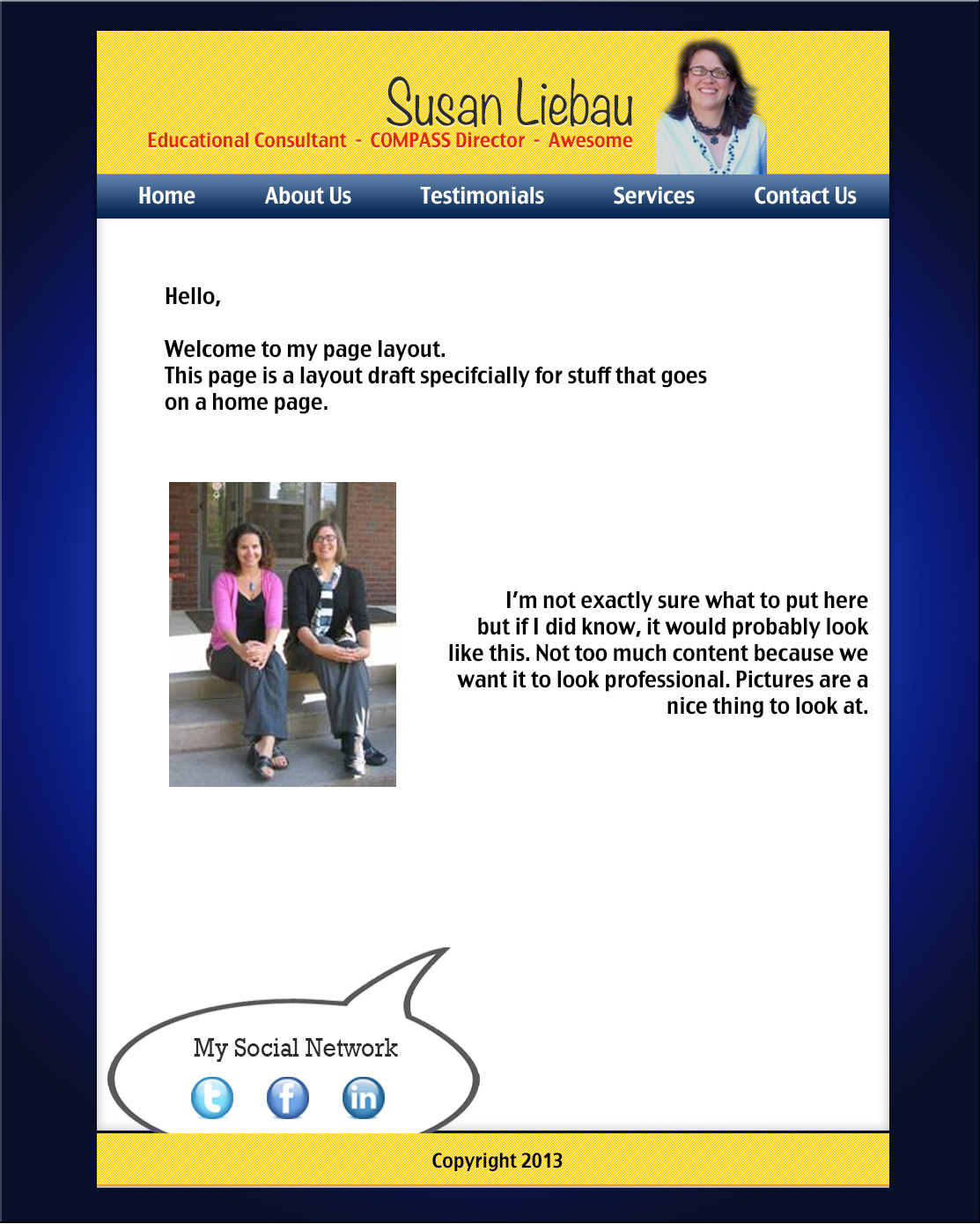
Okay, keep in mind this is a very very rough draft. If you read the little speech bubbles in the third screen you'll get a better idea of what I'm going for. Any feedback on the idea would be great, and if you have any questions send 'em my way.
Charlie, Charlie Kang.
Charlie, Charlie Kang.
Client Website Homepage Draft
Here is the link to my Client Website Homepage Draft! :)
Note that the colors in the PDF are a little off.
Note that the colors in the PDF are a little off.
Client project
Here is a link to my draft. It's quite rough so please feel free to offer any advice you think would help me! Thanks :)
Client draft!
Here's the link to my draft!
The dimensions are super weird right now so I"ll definitely change those up. I'm also playing around with the colors a lot since my client prefers I use red/green, so I tried to use colors from the image but let me know what you think!!!
The dimensions are super weird right now so I"ll definitely change those up. I'm also playing around with the colors a lot since my client prefers I use red/green, so I tried to use colors from the image but let me know what you think!!!


Client Home Page Drafting
Here are some ideas I've been playing with... These are by no means complete, but I would really appreciate any feedback you have :) Thank you!


Client Site Draft
Here is a link to an image of my client site draft! Any feedback would be greatly appreciated :)

Lessons 6 and 7, Client Image Example
Lessons 6 and 7 of Osborne are centered around advanced layout features one can achieve and incorporate into their site using Dreamweaver.
Chapter 6: This chapter talks about many important topics, including creating columns, list-based navigation bars, how to change the column size and shape and how to create most sophisticated navigation bars. For my client website, I would like to try and incorporate a horizontal navigation bar, so I think this chapter will be especially useful.
Chapter 7: This chapter mostly talked about the different ways yo can work with tables on your website. Specifically, they talked about how to create and modify tables, how to style them in both HTML and CSS, and how to import and sort table data. For my client website, I'm not sure if I will have any use for a table, but one place where it may be useful is displaying a breakdown of pricing for the different kinds of jewelry. I will need to think that through a little more.
Also, to give everyone a sense of what I will be working with for my client project, I wanted to show the piece of jewelry my friend made (which I am buying because it's just too damn cute). :)
I love this owl and the matching earrings!
Chapter 6: This chapter talks about many important topics, including creating columns, list-based navigation bars, how to change the column size and shape and how to create most sophisticated navigation bars. For my client website, I would like to try and incorporate a horizontal navigation bar, so I think this chapter will be especially useful.
Chapter 7: This chapter mostly talked about the different ways yo can work with tables on your website. Specifically, they talked about how to create and modify tables, how to style them in both HTML and CSS, and how to import and sort table data. For my client website, I'm not sure if I will have any use for a table, but one place where it may be useful is displaying a breakdown of pricing for the different kinds of jewelry. I will need to think that through a little more.
Also, to give everyone a sense of what I will be working with for my client project, I wanted to show the piece of jewelry my friend made (which I am buying because it's just too damn cute). :)
 |
| "Sleeping Cat Jewelry" by Jamie |
I love this owl and the matching earrings!
webpage draft of client project in Illustrator/Photoshop
Upload or hyperlink reference your draft here!
Lessons 6&7
Lesson 6 discusses the use of AP Divs and floats. I was trying to figure out how to wrap text around an image when using HTML and couldn't figure it out so this chapter was very helpful for me. It also talked about setting up columns and a navigation bar. These will be very helpful for me when I go to set up my client site because I want to have two separate columns on some pages along with a navigation bar along the top. The site I have in my head actually looks somewhat like the site they make in this chapter.
Lesson 7 talks about the use of tables. I used tables to set up my navigation bar in our first assignment because I didn't know how to do it any other way. In my client site, I don't think I will have any use for a table, but it is nice to know how to do them correctly in dreamweaver. They also show you how to make the table look really professional and nice using CSS so if I change my mind and want to include one, this will be very helpful as well.
Lesson 7 talks about the use of tables. I used tables to set up my navigation bar in our first assignment because I didn't know how to do it any other way. In my client site, I don't think I will have any use for a table, but it is nice to know how to do them correctly in dreamweaver. They also show you how to make the table look really professional and nice using CSS so if I change my mind and want to include one, this will be very helpful as well.
Float Center?...No.
Don't you hate it when (because of the procrastinator in all of us) you post late and when Wendy opens up the blog, your post is right on top for everyone to read? Yeah, it makes me feel uncomfortable too. So instead of writing about the reading right away I'm going to blab a bit up here so that (just in case I was the last person to post before class) everyone doesn't have to read my post. You know, so it's not too awkward.
Anyways....
Is it just me, or if we could code to float something center in html or css...life would be SO simple? I feel like for our previous assignments I spent the most time trying to float elements and divs for my the layouts of my pages...These chapters would have been SO helpful when trying to get the layout of my page put together. Floating is pretty neat. We have the ability to float anything we want, from columns, to images, to text, and literally anything you put inside of a div, cuz then you can just float the div. There was a lot of useful information on how to format different elements of your page in chapter six, but I feel the most useful were the column formatting and floating properties.
So as we have been told, web design is, and has a been transitioning from a table-based formatting and layout style to a focus on using a CSS layout- but according to chapter seven, the table is reclaiming its original purpose of displaying tabular data. In my opinion, this chapter would be more helpful if the websites I would be creating are in need of tabular data...but not gonna lie, I really hope those arent the types of websites I'll be coding someday. However, if I do end up having to incorporate tabular data, this chapter is useful because it provides us with ways to modify the table size, import data, modify the tables structure and basically anything and everything you would ever want/need to do with a table. Aka, a great reference for table making in html.
Definitely two chapters to bookmark.
Monday, March 25, 2013
Floating, Clearing, Navigating...Tabling?
Well here's a few things I just recently got into using, and one I think I've only used on about three occasions. Floats and clears are new territory for me with this class and my internship, and tables are something I honestly never had a reason to use except for maybe two small projects I had worked on.
Float and clear are honestly two of the most important style aspects that I learned when I began investigating liquid layouts. They are so helpful in maintaining a general look or feel to the page even as you expand or contract without having to set something's pixel location in stone. If it weren't for learning about float and clear, my first webpages logo and navigation bar probably would have looked disastrous. I still have a lot to learn about these two elements, and the book has some great information on it that I will definitely be consulting while I continue to try my hand at it.
Tables are something I'm well familiar with how to make, but have had very few reasons to actually make one. It's rare for me to have some sort of raw data or calendar of events that can't be better represented with divs and id tags. That isn't to say I don't see the merit in tables, just that with what I've worked with there's never been a lot of use for them. It was great to review the tables section in the book as it's definitely been a while since I even really thought about them. I'm also hoping for some reasons in the future to utilize a table (not just for play but actually on a page I'm developing!) and really hone that area of html further.
The navigation and advanced page layout information was definitely something I'm thankful for the book covering, and just super important in my opinion. We went over it before with site architecture: you need that strong navigation to build a good web design, and the book helps solidify that. On the note of page layouts I was very glad that the tables section discussed how tables should be for tabular data, not placing content on a web page. I never realized how tempting that is to some, but I think it was a great clarification for the book to make. While they can serve similar purposes, layouts and tables are separate things entirely and making that distinction can help you build stronger framework to paint your design on.
I'm excited about getting more into new and barely-used concepts for myself, and I can't wait to see what more we have in store!
"Design is not the narrow application of formal skills, it is a way of thinking." -Chris Pullman
Floating Columns and Tables
The first section of the reading went into how to use the float and clear properties to create a column layout on a webpage. This was actually really helpful, since I've been trying to figure out what float does for a while now, and have been struggling to use it effectively. I really enjoy how column layouts look, and I was hoping to use columns in my client page, so lesson 6 will come in handy for that.
Lesson 7 made me realize that I've been guilty of using tables for a bit more than organizing tabular data. I've definitely noticed that tables aren't ideal for layouts, and it's very clear that CSS takes the cake in that arena. Nonetheless, tables are an awesome element and can really add a sense of order to information and are really just a great way to visually break up and add organization to a page that is info-heavy. Not to mention that you can do quite a bit of formatting and styling to tables in Dreamweaver, which is great.
In other news, I found this fun (if outdated) comic about using CSS over tables. It's a bit behind the times, but I still got a kick out it!
Lessons 6 and 7
Lesson 6 provided a lot of useful information on advanced page layouts, including how to create floating images and how to create navigation bars. Both are widely used in websites, and it will definitely be helpful to refer back to this lesson while creating a website.
Next, lesson 7 provided more information on tables. It discusses how to go about creating tables in CSS and how to format them once they've been made. More good stuff to know and yet more stuff I wish I knew earlier but now I know!
Next, lesson 7 provided more information on tables. It discusses how to go about creating tables in CSS and how to format them once they've been made. More good stuff to know and yet more stuff I wish I knew earlier but now I know!
lessons 6 & 7
Wow, first of all todays readings are pretty short with just lessons 6 & 7.
Lessons 6 with how to create floating image. Which is surpassing looks a lot easier then coding a floating images in html. The next portion of the site is about creating columns within the website. Pages 159-164 is about how to create a navigation bar. Lesson6 also gives great encouragement on why you should create mock-ups when you design websites.
Lesson 7 is titled working with tables. The chapter is all about working with tables. This lesson is about teaching us to work with tables inside of CSS.The chapter teaches us how to create tables as well as formatting tables. Also the chapter introduces a lot of other concepts about tables.
Lessons 6 and 7
Once more, looking back it would have been very easy to make my previous page with these resources. It is nice however to understand what is going on. Looking through the instruction on using table specifically, i understood what many of the different things were and how to format and style them. Again these instructions will prove invaluable when designing webpages.
The information on float was interesting. When designing the first webpage I was trying to do something similar and ended up altering the margins on a heading. DreamWeaver allows for much more defined alterations to the page and really allows the user to design the page how we want.
The information on float was interesting. When designing the first webpage I was trying to do something similar and ended up altering the margins on a heading. DreamWeaver allows for much more defined alterations to the page and really allows the user to design the page how we want.
Lessons 6 and 7
The majority of Lesson 6 described the use of the float and clear properties when choosing layouts for objects in a webpage. The floated property was created to allow text to wrap around an image, but only allows "left", "right", and "none" justifications; it can not be floated to the center. The clear property says which sides of an element floating elements are not allowed and can be applied to an element with the values "left", "right", or "both". The lesson also talks about what makes a good layout and how to make something change color while hovering over an object. What I found most interesting, however, is that the lesson had mentioned quite a bit about optimization for IE 6. Why this matters, I have no clue, but I found a good reason why no one should have the web browser anymore here.
Lesson 7 was a bit more interesting for me, because it went into talking about tables and how to create them. I personally do not believe in changing table sizes through the design panel of Dreamweaver, because when the browser size changes, it makes the table look weird. I think it is better to know the dimensions of the finished table before going to Insert > Table. Also, if something is designed in purely HTML, when you change the style sheet of the website, the code for that object will not change. So, I just find that tables are best not to mess with too much after they've been created (but of course, this is just personal preference).
Also, did anyone else notice the random gradient thrown into the table on page 194? It was really bothering me that they did not say how to put that there (just how to change the color), so I looked it up. I think they just imported an image as the background for that part of the table, which Adobe's website says you can do by selecting the table element you wish to add in the Document window (design view) and changing the background field in the Property inspector.
Snippets and Templates
Lesson ten discusses the importance of how to maximize the rate of efficiency when creating/styling a website in Dreamweaver. The two important concepts used to achieve this are snippets and templates. Using snippets and templates allow a website creator to make or edit pre-existing style elements that can be reused throughout multiple pages and sites (projects).
"snippets make it possible you to add any piece of code to a common library, where you can reuse it by simply dragging and dropping it into the page" (Adobe Dreamweaver CS5 - Digital Classroom)
I relate snippets in Dreamweaver to what creating a color swatch in Photoshop is like. Snippets can be created or edited as a permanent element that you can use throughout the Dreamweaver program when a creator is working on projects. Using these snippets is a great advantage because they allow you to one, keep consistency in style/design work and two, work faster.
Templates are similar. From what I understand in the text, templates are (for a beginner) better to choose from what the Dreamweaver program provides. These templates create a basic form for a creator's content and design to be built around. Once again, templates will come in handy when I want to keep my design constant from project to project or even within one project.
The text will be a great step by step reference to go back to when I start the next in-class activity.
Friday, March 22, 2013
Even More CSS
In html.net's article, it is shown how similar CSS is to HTML. I made the connection between them looking similar because, I believe it was Alex?, told us in class that CSS was made for HTML. So them looking very similar in coding only makes sense. The example they give us is this:
HTML:
HTML:
<body bgcolor="#FF0000">
CSS:body {background-color: #FF0000;}
Both of those do the same exact thing. As you can see, both use the terms body and are very similar on how they write "background color." They also have their differences being that HTML uses carrots (< >) while CSS uses curly brackets ({ }), HTML uses = while CSS uses :, and CSS doesn't use any "s on the hex code.
The most important part to me I found in w3.org's article was controlling white space. The article states its importance for "when you want a lot of white space before a particular heading or paragraph, or when you need precise control for the general spacings." I myself love the use of white space in a website and it doesn't always need to be white. It just makes the entire site easier on the eyes.
Thursday, March 21, 2013
Visualization of the Internet
Here's an article about a new app that is an infographic/visualization of the internet. The article explains how helpful the app is at showing people how the internet works. Yay, visual learning.
http://www.fastcodesign.com/1672150/infographic-an-app-that-maps-the-web-in-real-time?utm_source=twitter#1
http://www.fastcodesign.com/1672150/infographic-an-app-that-maps-the-web-in-real-time?utm_source=twitter#1
More CSS!
These two readings offered further tips and examples of using CSS. The more I see examples of CSS code, the less terrifying the whole concept becomes, which is great! I'm starting to see more and more ways that using CSS will be really great in actually designing and coding my client webpage. As I said in my previous post, CSS opens up a ton of new doors when it comes to the design choices that I have at my disposal.
I especially enjoyed Dave Ragget's piece because it showed code for many of the basics of CSS. These will be extremely helpful when it comes to coding the client site. It's always nice to have a reference to look back on when I'm trying to make heads or tails of my code as I'm starting out. The color swatches will also come in handy, even if they are pretty limited. Still, they offer a nice base to work from at the least. The HTML.net article helped to reinforce the structure of CSS code. Knowing the syntax helps me to understand exactly why the CSS code is what it is. I also liked the external style sheet diagram, as it put the function of the sheet in visual form. Having the power to make changes across multiple pages makes life immensely easier, so I'm looking forward to trying an external sheet out!
I especially enjoyed Dave Ragget's piece because it showed code for many of the basics of CSS. These will be extremely helpful when it comes to coding the client site. It's always nice to have a reference to look back on when I'm trying to make heads or tails of my code as I'm starting out. The color swatches will also come in handy, even if they are pretty limited. Still, they offer a nice base to work from at the least. The HTML.net article helped to reinforce the structure of CSS code. Knowing the syntax helps me to understand exactly why the CSS code is what it is. I also liked the external style sheet diagram, as it put the function of the sheet in visual form. Having the power to make changes across multiple pages makes life immensely easier, so I'm looking forward to trying an external sheet out!
CSS
When making my first webpage, I had a bit of trouble trying to create the borders I wanted. CSS is going to make all of that easier for me. After reading the readings assigned for today, I have only further realized how much CSS is going to help me out when making my client web site. I liked the section in Adding a Touch of Styling that discussed browser safe colors. When I was making my personal web page, I didn't really think of how my site would look on different browsers. This made it so some of my pictures didn't show up and my colors and fonts looked different. I also found it important that there are some browsers (Internet Explorer 4.0 and Netscape 4.0) that don't support CSS. Selecting the colors and fonts and design is a very important part of creating a web site and these articles will be great in helping me make the right decisions as far as my design goes.
CSS...continued
The articles assigned for today touched base on similar concepts that we had discussing in class on Tuesday. I'm not complaining, any resource and information about CSS I can read will be helpful. Coding is a complex language that has many different aspects to learn in order for a website to be successful. Learning about CSS (or HTML) can be frustrating because as soon as I think I understand what's going on a curve ball comes out to throw me off.
These articles clear up some of that confusion by giving easy to understand definitions, then visually showing how the code will appear. If it's one thing I have learned so far in this class it's: learn by example / trial and error. The articles will be great side-by-side instructions to go along with the Dreamweaver book.
These articles clear up some of that confusion by giving easy to understand definitions, then visually showing how the code will appear. If it's one thing I have learned so far in this class it's: learn by example / trial and error. The articles will be great side-by-side instructions to go along with the Dreamweaver book.
Some More CSS
I really like talking about style
and design elements of website design. It’s where you really feel like you can
express yourself. I really liked the article from W3 by Dave Raggett. I found
his step-by-step explanation to be really easy to follow and easy to
understand. When we were going over these topics on Tuesday I was a little
confused, but now after reading this article find it very easy to comprehend. I
will definitely be revisiting this article as I begin to work on my website.
The second article isn’t
quite as intense as the first, but it still gets a lot of good information
across. It explains the three methods of including CSS within your document and
the advantages of each. Though, it does encourage the use of external CSS due
to the advantage of being able to change one thing and have it affect all of
your HTML documents that are linked to that style sheet.
Wednesday, March 20, 2013
Has anyone heard of Coursea?
If our lives weren't already busy enough.
There is a course about Human Computer Interaction starting in 2 weeks.
Helping you build human-centered design skills, so that you have the principles and methods to create excellent interfaces with any technology.
Coursera HCI Course
This course is free.
Its taught from a professor at Stanford.
I found that the videos are already posted.
Check it out if you have any extra time.
CŠŠ
Adding a touch of style to our Cascading Stylesheets. I was a freshmen in high school when this was written. Ouch, I am getting old. Nonetheless, the internet hasn't changed too much. Lets see, the author suggests that we should set the page margins which makes sense. The author also talks about controlling the white space above and below. Makes sense. The dreaded em's are hard for me to calculate, but the good thing about it is that it scales with the size of the font. Basically the author shows how to control the font size and setting the font family. This kind of stuff is definitely important, it explicitly calls out what does what. The more things that we imply, the more ways things can get messed up.
The author mentions that older browsers before Netscape 4.0 and IE 4.0 dont support CSS at all or do so inconsistently The author gets my praise for actually using CSS in his code. :) I appreciate the author having a hexadecimal color values, but with the app Wendy showed us, this becomes outdated. He brings up some great points about colors not displaying in the browser correctly. Makes sense. Pretty cool stuff.
The author mentions that older browsers before Netscape 4.0 and IE 4.0 dont support CSS at all or do so inconsistently The author gets my praise for actually using CSS in his code. :) I appreciate the author having a hexadecimal color values, but with the app Wendy showed us, this becomes outdated. He brings up some great points about colors not displaying in the browser correctly. Makes sense. Pretty cool stuff.
More CSS
Once again we are on CSS. This time we were focused on style
sheets; which is good because I’ve never used a separate style sheet before. I
do know that linking a separate piece into code is important because if you don’t
do it properly everything can be ruined. It makes since that the link has to go
in the header of the html; it’s part of the brains of the code. The rest was
just basic things you could do with CSS. The whitespace control caught my head;
for my client that is important because the last website they had had made had
way too much whitespace that made the website look horrible. I plan to not have
that happen and want to use CSS to make sure the white space is useful.
Subscribe to:
Posts (Atom)