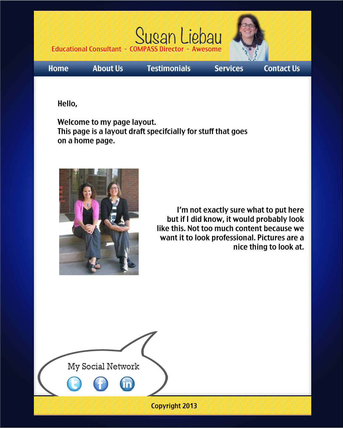
I think this is really solid start! However, the yellow is a little bit hard on my eyes against the really dark background. Also, I would consider trying a color aside from red for the words under Susan's name. Possible a blue? I might also add another image or something to balance out the white space.
However, I really like the blue/black frame and the layout. It's easy to follow and certainly clean and professional!
I also really like your design. It looks really professional and I like your color choices. However, I do agree that the red on the yellow is a bit hard to read and hurts my eyes to look at. Also there is a lot of white space and I think it would look better if you brought up the footer a bit more so that the page isn't so long and the information is just a little closer together. Other than that I really like your webpage!
I really appreciate the feedback. The Red somehow got overlooked and I completely agree. It will be removed. As for the whitespace, thank you. I will definitely keep this into consideration. I do not like alot of words, so I hope to have alot of visual! Thanks again!
I think this is really solid start! However, the yellow is a little bit hard on my eyes against the really dark background. Also, I would consider trying a color aside from red for the words under Susan's name. Possible a blue? I might also add another image or something to balance out the white space.
ReplyDeleteHowever, I really like the blue/black frame and the layout. It's easy to follow and certainly clean and professional!
I also really like your design. It looks really professional and I like your color choices. However, I do agree that the red on the yellow is a bit hard to read and hurts my eyes to look at. Also there is a lot of white space and I think it would look better if you brought up the footer a bit more so that the page isn't so long and the information is just a little closer together. Other than that I really like your webpage!
ReplyDeleteThanks Travis and Meridith,
ReplyDeleteI really appreciate the feedback. The Red somehow got overlooked and I completely agree. It will be removed. As for the whitespace, thank you. I will definitely keep this into consideration. I do not like alot of words, so I hope to have alot of visual! Thanks again!